How to create Text Cutout Effect in CSS

I am 17 years old and a young passionate and self-taught frontend web developer and have an intention to become a successful developer. I usually write about JavaScript and Web Development and share some tips in the articles.
Introduction
One of the most important aspects to consider when developing a website is styling. The goal of developers and designers is to create beautiful and accessible websites.
In this article, I'll teach you a mind-blowing CSS trick that will make your website look amazing.
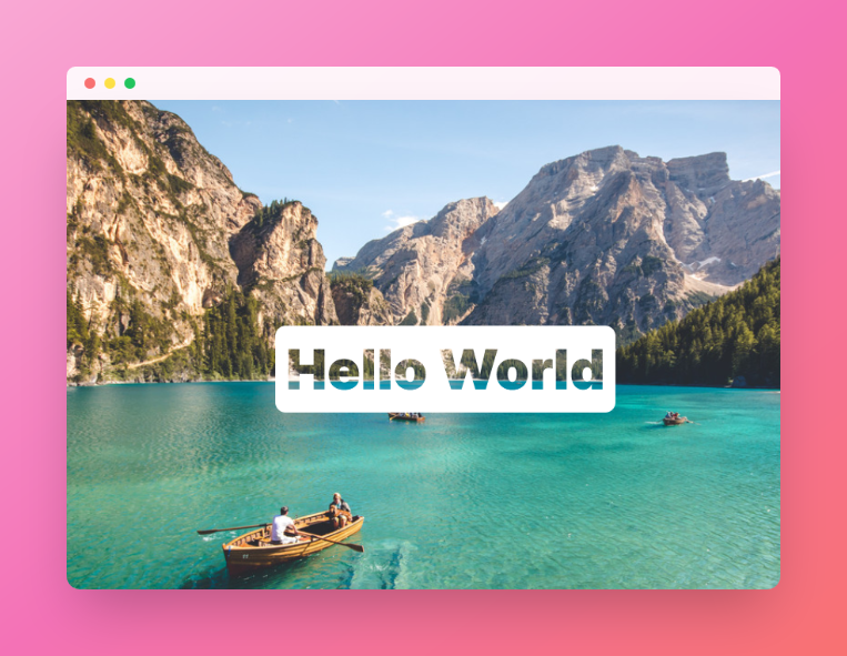
Here's a look at the final output:
Shall we get started?
Step:1 Create HTML Structure
Layout the page using a basic HTML structure.
<div class="container">
    <h1 class="text">Hello World</h1>
</div>
Let's add an img tag for background image
<img id="background" src="https://i.postimg.cc/C1C8VHcK/pietro-de-grandi-T7-K4a-EPo-GGk-unsplash-1.jpg" />
HTML full code
<img id="background" src="https://i.postimg.cc/C1C8VHcK/pietro-de-grandi-T7-K4a-EPo-GGk-unsplash-1.jpg" />
<div class="container">
    <h1 class="text">Hello World</h1>
</div>
Step:2 Creating Text Cutout Effect
  padding: 12px;
  background-color: white;
  mix-blend-mode: screen;
mix-blend-mode: screen performs a major role in creating this effect.
Source code
<img id="background" src="https://i.postimg.cc/C1C8VHcK/pietro-de-grandi-T7-K4a-EPo-GGk-unsplash-1.jpg" />
<div class="container">
    <h1 class="text">Hello World</h1>
</div>
@import url('https://fonts.googleapis.com/css2?family=Inter:wght@100;200;300;400;500;600;700;800;900&display=swap');

body{
  font-family: 'Inter', sans-serif;
  margin: 0;
  padding: 0;
}
#background{
  position:absolute;
  z-index:-1;
  width:100%;
  height:100%;
}
.container{
  display: flex;
  justify-content: center;
  align-items: center;
  min-height: 100vh;
  z-index: 1;
}
.text{
  padding: 12px;
  background-color: white;
  mix-blend-mode: screen;

  font-weight: 900;
  border-radius: 12px;
  font-size: 4rem;
}
Conclusion
CSS can now be used to easily create stunning text cutout effects. I'd love to see your creations, so please share them in the comments.
Thank you for reading!
Let's Connect
- Twitter - @codewithsnowbit
- GitHub - @codewithsnowbit
- Support my work