How to create gradient shadow in CSS
Published
•1 min read
D
I am 17 years old and a young passionate and self-taught frontend web developer and have an intention to become a successful developer. I usually write about JavaScript and Web Development and share some tips in the articles.
In this article, I will show you an easy way to create a gradient shadow in CSS.
Inside the HTML file first, create a div:
<div class="shadow">
  <div class="circle">
</div>
Now it's time to give style it,
.shadow {
  filter: blur(100px);
}
You can adjust the blur to your liking.
Creating the shadow,
.circle {
  background: radial-gradient(
    at right bottom,
    rgb(209, 213, 219),
    rgb(192, 38, 211),
    rgb(234, 88, 12)
  ); /*   YOU CAN CHANGE GRADIENT */
  width: 200px;
  height: 200px;
}
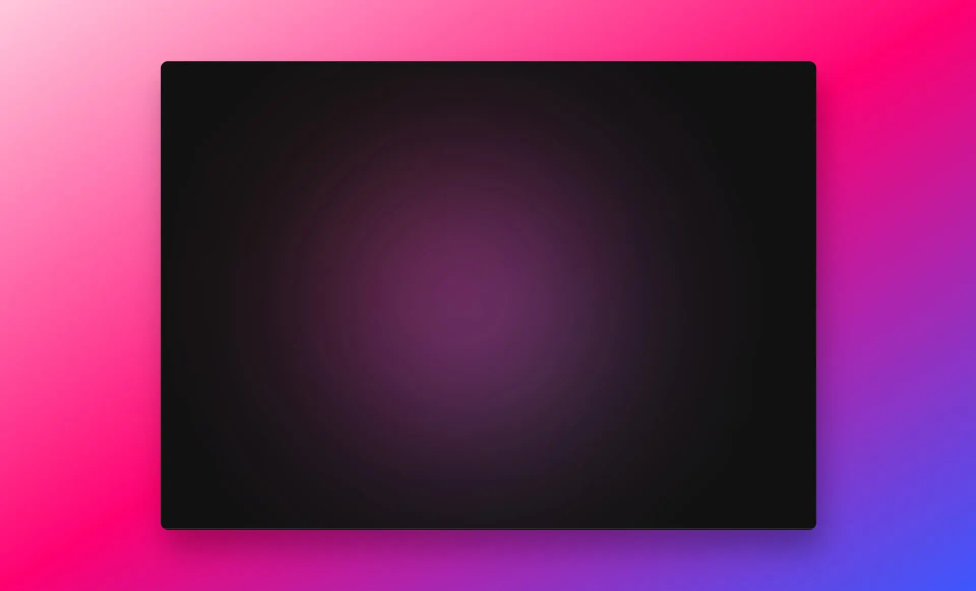
This will create the gradient shadow with only CSS:
If you'd like to see another example, check out this CodePen:
Thanks for reading
Follow me on Twitter
Thanks for reading!