Chat Layout with Tailwind CSS and Grid

I am 17 years old and a young passionate and self-taught frontend web developer and have an intention to become a successful developer. I usually write about JavaScript and Web Development and share some tips in the articles.
In this article, I will show you the easy way to create a chat layout with Tailwind CSS and Grid.
Let's go!
Setting up libraries
Import Tailwind CSS to your HTML file, by adding the following code to the HEAD tag:
<script src="https://cdn.tailwindcss.com"></script>
Structure
1. Creating message box
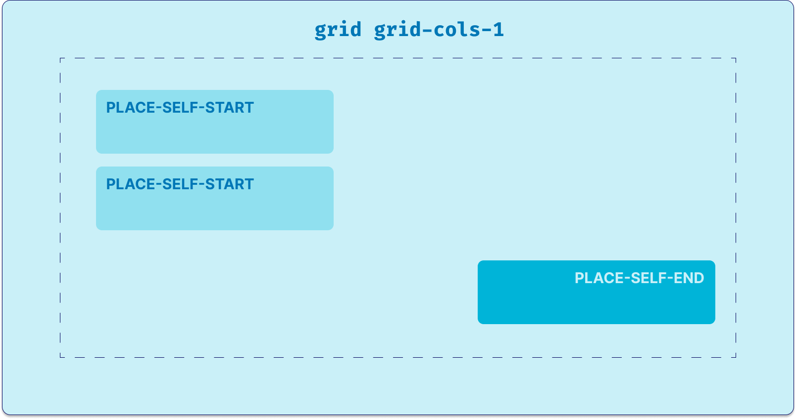
<div class="mx-auto grid max-w-screen-md grid-cols-1 space-y-10">
    <div class="place-self-start">
      <div class="rounded-2xl rounded-tl-none bg-green-50 p-5">Hey there, how are you?</div>
</div>
There will be two kinds of messages:
Sent by the user:
<div class="place-self-end">
  <div class="rounded-2xl rounded-tl-none bg-green-50 p-5">Okay! See you then.</div>
</div>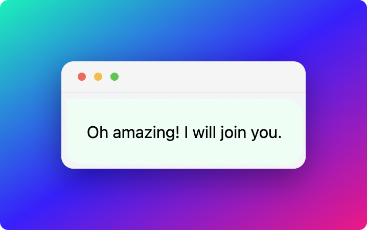
Incoming message:
<div class="place-self-start">
  <div class="rounded-2xl rounded-tl-none bg-white p-5">Hey there, how are you?</div>
</div>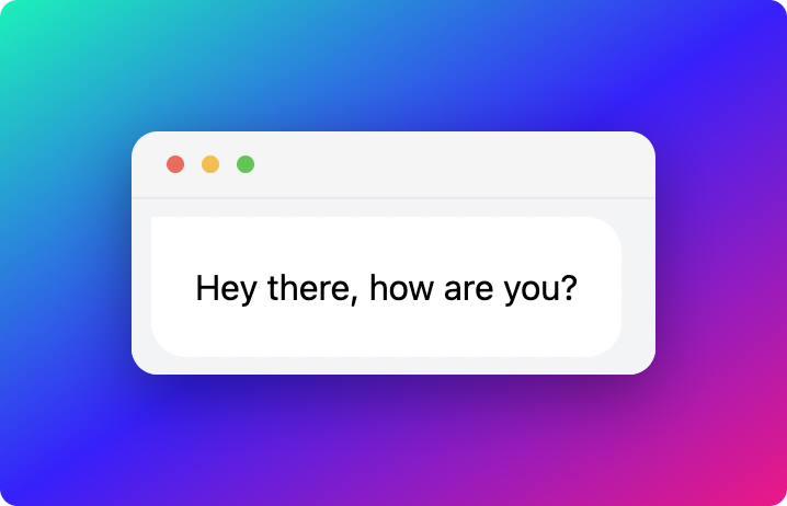
2. Code Explanation
Incoming message has given the class place-self-start which places the message box to the left end. And, the User sent message has given the class place-self-end which places the message box to the right end.
Conclusion
We have made a chat layout with comparatively low efforts, all thanks to Tailwind CSS.
If you're interested in the live version of it, please do check the attached Codepen:
Thanks for reading
Follow me on Twitter
Thanks for reading!